Review of Tombow VIP Club
Read MoreBlack Ink Review
This is another blog post that photography doesn't capture what the naked eye can see. Since I compared white inks in my previous post, I thought I'd compare some black inks.
Dr. Ph. Martin's Black Star (Matte) is a very dark, rich, black ink and is a good choice if you want a matte finish. However, when using this ink, fine hairlines are lost no matter how light a hand I used. I even tried to use a different nib and that didn't seem to work. I've also noticed that it can sometimes feather depending on the paper used. I'd advise testing this ink on your writing surface before committing to using this ink. The one nice thing is that this ink is waterproof, matte and very opaque.
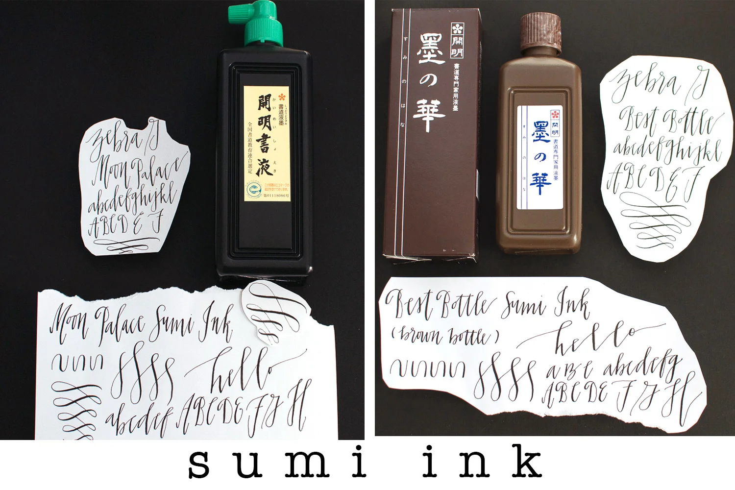
These are two nice sumi inks that I bought. The one on the left is Moon Palace and the one on the right is Best Bottle Sumi Ink. I purchased the larger size of Moon Palace since I love sumi ink for the opaqueness of the black and they make beautiful hairlines.
John Neal Bookseller sells these inks: the cost for Moon Palace is $15.95 for 450 ml (15 oz); the Best Bottle Sumi Ink is $15.85 for 200 ml (6.75 oz). I found both of these inks easy to use and both make beautiful hairlines and thick downstokes. I'm not sure Best Bottle is worth almost double the price of Moon Palace. I'll need to continue using both inks and comparing to see if the price of Best Bottle is worth it.
Happy writing!
White Ink
This review of white ink is not the best visually to do because it does not really capture what I can see.
My favorite white ink was Dr. Ph. Martin's Pen-White. Other calligraphers had recommended it and I liked how opaque it would write. The only trick is that you need to dilute this ink with water in another container. This can be tricky as to how concentrated it should be -- I've heard it described that it should be similar to whole milk or half & half -- a bit runny, with some viscosity to it. I keep experimenting by adding a few drops of water, stirring the ink together, and dipping my pen and writing. Start slow with the water because you can always add more water.
Then I read about Dr. Ph. Martin's Bleed Proof White. This is the winner! Who knew that white ink could be compared? The Bleed Proof White is brighter and whiter than the Pen-White. I recently had a calligraphy job that was lettering with white ink on white vellum envelopes. The Bleed Proof White made the difference in my calligraphy being able to stand out against the white semi-opaque background. The drawback is that it doesn't have a nice dropper to get the ink out, in fact this stuff is really thick and gloopy, you need a tiny spoon to get it out and then dilute it with water. I used an old chopstick.
In last place is the Bombay White India Ink. This is not as opaque as the Bleed Proof White or Pen-White, it doesn't have the brightness like the other two inks. However, this ink requires the least amount of preparation and doesn't need to be diluted with water. You can use the dropper and put your ink into another container to dip your nib into.
My recommendations is the Pen-White or Bleed Proof White, with the advantage going to the Bleed Proof White, but either ink will serve you well.
Happy lettering!
Books I'm Enjoying
in books
I'm enjoying this design book by Gingko Press about typography & branding. The book shows different styles of typography and divides the book into categories like elegant, handwritten, experimental, minimal. Of course I am drawn to the handwritten section and love looking at the different ways brands have incorporated handwritten typography into their various branding elements.
My book group's selection for March. In an attempt to have less clutter, I am trying to buy more ebooks. I'm still getting used to ebooks, I'm so old school that way because I love the feel of paper and having a book in my hands.
I probably should have bought this as an ebook because it is so long (962 total pages!) but it was on sale at Powell's (the amazing book store here in Portland, Oregon) and I couldn't pass it up since I had read so many good things about this book. This is going to take me some time to read but what I've read so far I've found thoughtful.
This book is about parenthood and to what extent do parents accept their children's limitations and love them for who they are, and how far should parents help their children become their best selves. He examines this from the point of view of parents who are dealing with children with differences such as deafness, dwarfism, Down syndrome, autism, schizophrenia, children who are prodigies, who are conceived in rape, who become criminals, who are transgender. He looks at how these differences unites these families.
There is a quote about parenting that really resonated with me: "Parenthood abruptly catapults us into a permanent relationship with a stranger, and the more alien the stranger, the stronger the whiff of negativity. We depend on the guarantee in our children's faces that we will not die. Children whose defining quality annihilates that fantasy of immortality are a particular insult; we must love them for themselves, and not for the best of ourselves in them, and that is a great deal harder to do. Loving our own children is an exercise for the imagination."
I hope you are also enjoying your own reading adventures!
New Items in my Etsy Store
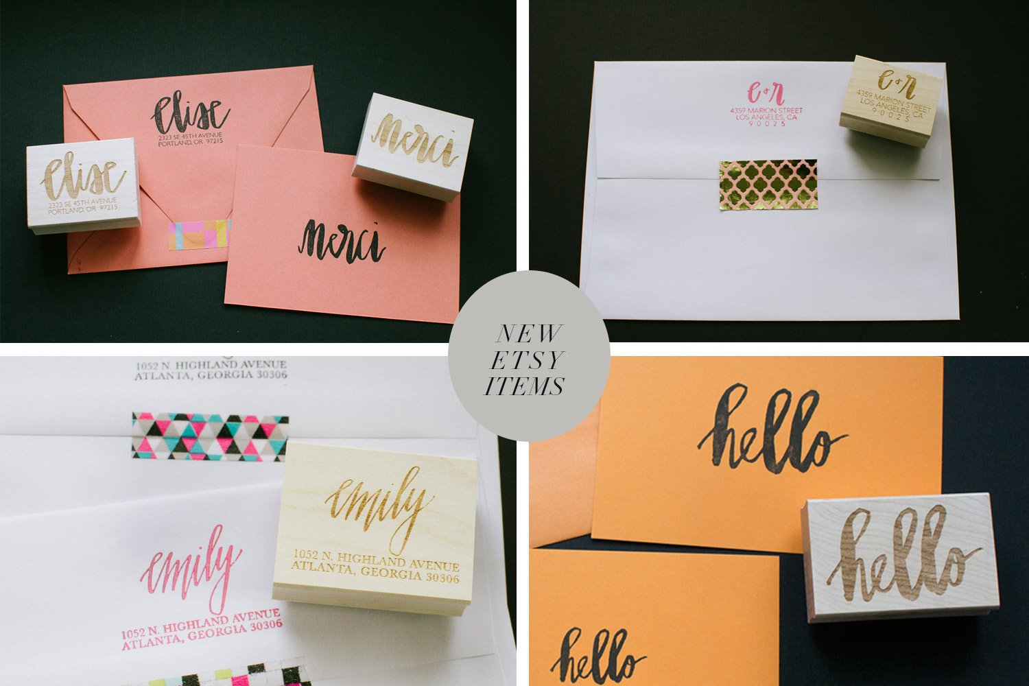
Yay! New rubber stamps in my Etsy store. I hope you like them.
How to Vectorize Your Calligraphy Using Photoshop & Adobe Illustrator
I've created a pdf link that is a step-by-step guide on how to vectorize your calligraphy in Adobe Illustrator and then use this file in Photoshop to make adjustments like adding color to your calligraphy to make it beautiful. You will need to have some experience with Photoshop and Illustrator to understand how to do this, but I tried my best to keep it simple.
I hope you find this useful!
Have fun!
p.s. Let me know if the instructions are confusing or are incorrect.
Brause 361
in nibs
The Brause 361 nib (aka "the blue pumpkin") is a medium type of nib -- some flex but not a lot and can be used with a lot of pressure to get dynamic contrast or used with a lighter hand and obtain less contrast and fine hairlines.
I think this nib is cool looking and I love the blue color. This nib uses the standard Speedball B holder.
I use this nib when a project calls for larger size lettering as this nib can maintain the integrity of the letters.
I like using this nib for envelopes when I am using a lettering style that calls for large lettering. This nib can hold a lot of ink before it needs to be reloaded. Be sure to take off any excess ink when reloading because you will get pooling of ink (which of course I was not able to replicate when I tried
I also like using this nib for print-style lettering -- I think the thick & thins look nice.
Have fun experimenting with this nib!
Tachikawa G Nib
in nibs
The Tachikawa G nib is a another nib from Japan that is similar to the Nikko G & the Zebra G nib.
The Tachikawa has a similar feel to both the Nikko G & Zebra G nibs, and you can vary the amount of pressure and still make beautiful marks. The nib has bit more flex in it which allows me to write with little pressure to get finer lines without a lot of contrast (see the word "peace" that I've created above, that was done with little pressure applied).
These nibs are sold in packs of 3 at Jet Pens for $4.00. I am using the Tachikawa wooden holder (which can also be purchased at Jet Pens in other fun colors); these nibs can also fit on the Speedball B holder (the black plastic standard holder). John Neal, Bookseller also sells them for $1.80 per nib; Paper & Ink Arts for $1.20 per nib. Paper & Ink Arts also offers a discount if purchased in bulk.
Like all the Japanese nibs I have reviewed (Zebra, Nikko, & Tachikawa), these nibs are very durable and will last a long time. You will know when it is time to change the nib when you find that you cannot create fine hairlines -- the calligraphy tip is getting dull and will not produce fine hairlines. Unlike other nibs that I throw away in the garbage when they get old because they simply do not work or break, I don't always throw away these nibs because you can still use them on lettering styles that do not require fine hairlines or to use for practice.
After doing this review and writing with this nib, I realized how much I like writing with this nib. I will now add this to my rotation of nibs that I use.
Zebra G
in nibs
This is one my favorite nibs. It's stiff but not too stiff and has a little flex to it (not as much as the Tachikawa G which will be reviewed in my next post).
You can still make beautiful marks with little pressure but also with more pressure, get more exaggerated thick & thin lines. I find that the hairlnes I make with this nib are finer than with the Nikko G and the downstrokes are not as thick as those made with the Nikko G. But the differences between the two nibs are very slight and could just be in my mind.
I am using a pronged style of nib holder with this nib but the Zebra G can also fit on the Speedball B holder (standard black plastic holder).
Since I have a bunch of calligraphy nibs on different holders, the way I can tell if the nib is a Zebra G from a Nikko G (without having to pull it off), is in the tines area (that is the area above the point/tip of the nib), the Nikko G has a pattern on that area, very thin horizontal lines, when you scratch your fingernail over that area, you can feel it. The Zebra G is smooth in that area.
I haven't found a store in Portland, Oregon that carries this nib, but they can be found at Jet Pens for a pack of 10 for $13.50; at Paper & Ink Arts for $1.95 each (pack of 10 is $18.50); or Amazon for $9.99 for a pack of 10.
Nikko G
in nibs
This is nib is favored by many modern calligraphers and is a good for beginners when starting on this journey of modern calligraphy.
This nib allows for beautiful thick & thin strokes with a heavy hand (i.e. a lot of pressure). When I was starting out, I did not know how to control the amount of pressure I was applying when practicing my lettering, there was so much to remember (when to apply pressure, make sure I'm not smudging my letters, when to load my nib with more ink, what angle to keep my nib at, etc.). But with time, your muscles learn how to apply pressure at different points while you are creating a letter.
I think my lettering has a more "gothic" feel to it when I use this nib. Excuse my spelling errors below, it's hard to concentrate on creating letters and spelling at the same time!
Here in Portland (Oregon), I have not been able to find a store that sells the Nikko G nib. I purchase my nibs from John Neal, Bookseller, Paper & Ink Arts, Jet Pens or Amazon.
Although I like this nib, this isn't my favorite nib at the moment to use, I prefer the Zebra G which I will be reviewing in my next post.